CA District 9 Voter data visualizations
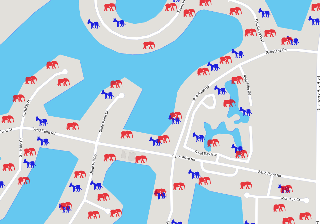
During the Zaplabs Summer 2017 hackday I had the privilege of working with a talented team of developers to build a few different visualizations of voter registration data. I requested the dataset of voter registration for my congressional district: CA 9. This has a surprising amount of info about each household including party affiliation of each resident and the list of recent elections they voted in. The aggregate party affiliation of a neighborhood is an interesting facet of the character of an area.
The video above shows a few of our visualizations, starting with the 3d bar graphs of the Democrat vs Republican party affiliation totals of the map area within the viewport. The next part of the video splits the viewed area of the map into 4 quadrants and shades the quadrant with the dominant party color. The final section of the video shows a heatmap of clustered voter locations with the current district representative Dr Jerry McNerney along with his voting record. I personally support Representative McNerney and hope he continues to win reelection.
My team members were the fantastic backend engineers: Willem Jager, Avishag Kedar, Frank Chung and Justin Zhong. They quickly loaded all from the csv source files, supplemented it with lat, lon information and deployed new microservice API endpoints to return aggregate and detailed information via geographic queries, clustering as well as elected representative information. On the frontend I used server and client side javascript, mapbox's webgl version with 3d extrusions, geojson overlays and heat maps to represent the political affiliation of residents in whatever bounding box the map is directed towards from the tiny area when zoomed in close to the entire federal congressional district when zoomed out. After Willem built some clustering endpoints he drew the party animals and built another cool clustering visual pictured below: